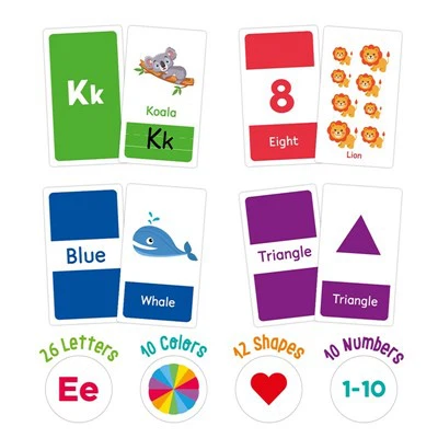
To print perfect learning cards, many factors must be considered. Color is a crucial component; high-quality learning cards resonate with readers, enhance product perception, and effectively convey information.
The base paper for learning card printing must be inspected, adhering to technical standards. Paper that doesn't meet these standards should be rejected to avoid color variations caused by the base paper.
Color selection for learning card printing primarily involves considering ink properties such as color intensity, grayscale, hue error, tinting strength, transparency, viscosity, fineness, and color stability. These factors form the technical standards for the ink.
Learning cards typically use large areas of light-colored backgrounds, pale backgrounds, and compositions with brown accents or light yellow or white patterns and lines within brown blocks; light green backgrounds with dark green compositions, pink backgrounds with bright red compositions, light gray backgrounds with black compositions, etc. The visual effect they produce is bright, simple, gentle, and elegant. Currently, one of the most frequently used and widely applied color schemes in design is the clever use of two shades of color simultaneously on a single image to create a harmonious visual effect.