Do promo playing cards have a specific color scheme?
Hey there, folks! I'm a supplier of promo playing cards, and today I wanna chat about whether these promotional beauties have a specific color scheme.
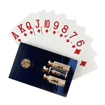
First off, let's understand what promo playing cards are all about. They're not your regular deck of cards. These are custom - made cards used for advertising, branding, or special events. You can find them at trade shows, corporate parties, or as giveaways to promote a business or a product.
Now, when it comes to color schemes, there's no one - size - fits - all answer. In essence, promo playing cards don't have a strict, pre - defined color palette that everyone has to follow. It all boils down to the brand or the message they're trying to convey.
Let's take a look at some common factors that influence the color choices for promo playing cards.
Brand Identity
If a company is using promo playing cards for branding purposes, they'll usually go with the colors that are part of their brand identity. For example, if a brand's logo is in blue and white, it makes perfect sense to use those colors on the playing cards. This helps in creating a consistent brand image. Customers who receive these cards will immediately associate them with the brand. It's like a little piece of the brand in their hands.


Let me give you an example. A tech startup with a modern and sleek brand image might choose a color scheme of black and silver. These colors give off a high - tech, sophisticated vibe. The back of the cards could be black with a silver logo, and the faces of the cards could have some silver accents too. This not only looks cool but also aligns with the brand's overall aesthetic.
Purpose and Theme
The purpose of the promo playing cards also plays a huge role in determining the color scheme. If it's for a fun - filled casino - themed event, you'll likely see bright and bold colors like red, green, and gold. Red is often associated with excitement and energy in a casino setting, while green is reminiscent of the casino table felt, and gold adds a touch of luxury.
On the other hand, if the promo cards are for a more serious business event, more subdued colors like navy blue, gray, or brown might be used. These colors convey professionalism and trust. For instance, a financial institution promoting its services through playing cards might choose a navy blue and white color scheme to give a sense of stability and reliability.
Target Audience
Understanding your target audience is crucial when picking a color scheme for promo playing cards. Different age groups and demographics have different color preferences. Younger audiences might be more attracted to bright and vivid colors, while older audiences might prefer more classic and muted tones.
For example, if you're promoting a new video game aimed at teenagers, you could go for neon colors like pink, purple, and lime green. These colors are eye - catching and trendy among the younger crowd. But if you're marketing a retirement planning service to seniors, earthy tones like beige, olive green, and light brown would be more appropriate.
Now, let's talk about some popular color combinations that work well for promo playing cards.
Complementary Colors
Complementary colors are colors that are opposite each other on the color wheel. For example, red and green, blue and orange, and yellow and purple. Using complementary colors on promo playing cards can create a high - contrast and visually striking effect.
Let's say you're creating promo cards for a sports event. You could use a red and green color scheme. The red can represent passion and energy, while the green can symbolize nature or the sports field. This contrast makes the cards stand out and grabs people's attention.
Analogous Colors
Analogous colors are colors that are next to each other on the color wheel. For example, blue, blue - green, and green. This color combination creates a harmonious and calming effect. If you're promoting a spa or a wellness center, an analogous color scheme of light blue, turquoise, and green would be perfect. It gives a sense of relaxation and tranquility.
As a promo playing cards supplier, I've had the opportunity to work on a variety of projects. And I can say that the color scheme is just as important as the design itself. A well - chosen color scheme can make the cards more appealing, memorable, and effective in getting the message across.
If you're in the market for some high - quality promo playing cards, we've got you covered. We offer a wide range of options, from Advertising Poker to Texas Poker Set and Personalised Poker Gifts. Whether you have a specific color scheme in mind or need some advice on the best colors for your project, our team of experts is here to help.
We understand that every brand and event is unique, and we're committed to creating promo playing cards that meet your specific needs. So, if you're interested in working with us, don't hesitate to reach out. Let's start a conversation about how we can make your promo playing cards stand out from the crowd.
References
- Color Psychology in Marketing, Various Marketing Journals
- Branding and Design Principles, Design Industry Publications